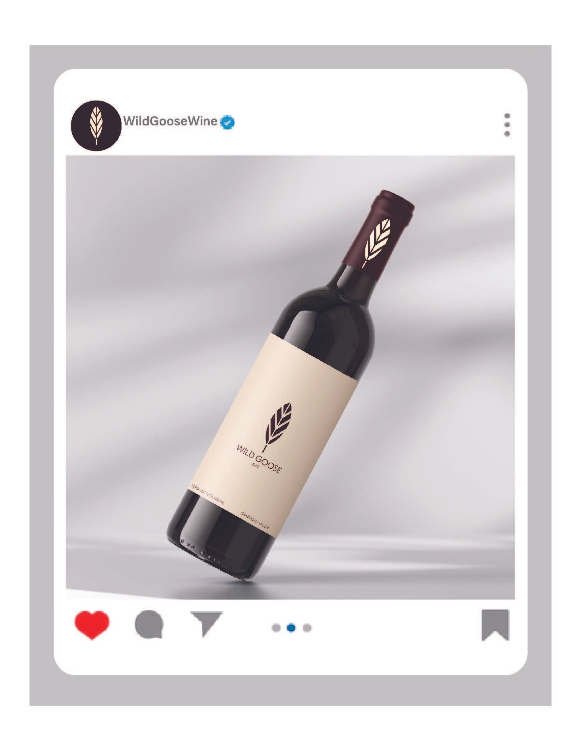
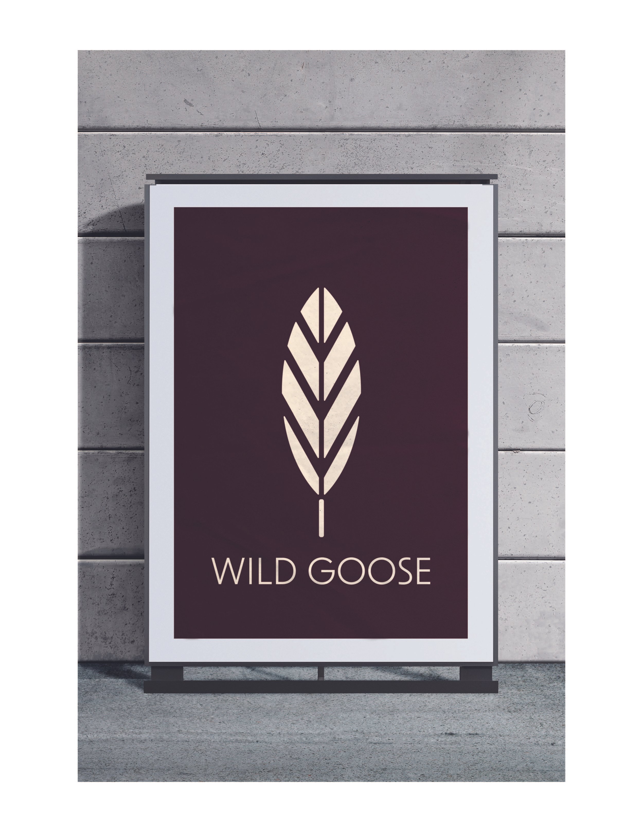
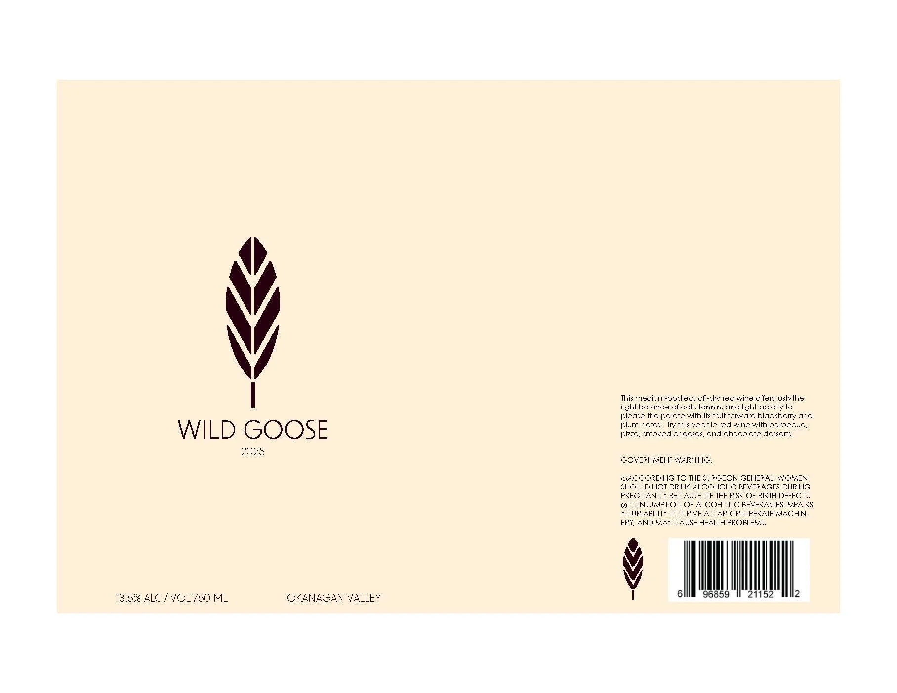
Wild Goose Wine Label Redesign
For this design, I chose a nuetral background to really help the elegant maroon stand out. The colors compliment each other very well and even when inversed on the cap of the bottle. The simple and symetrical logo design really helps create a classy feel for the viewer as well.